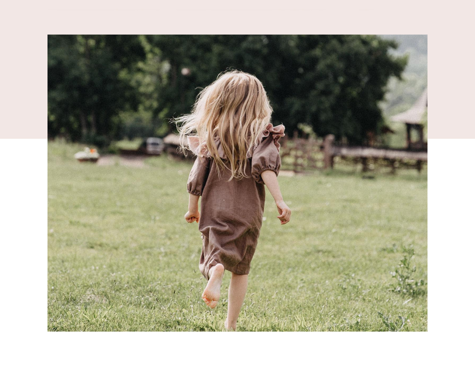
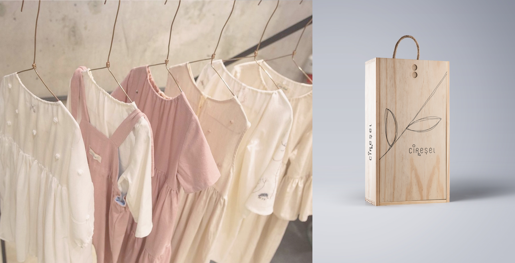
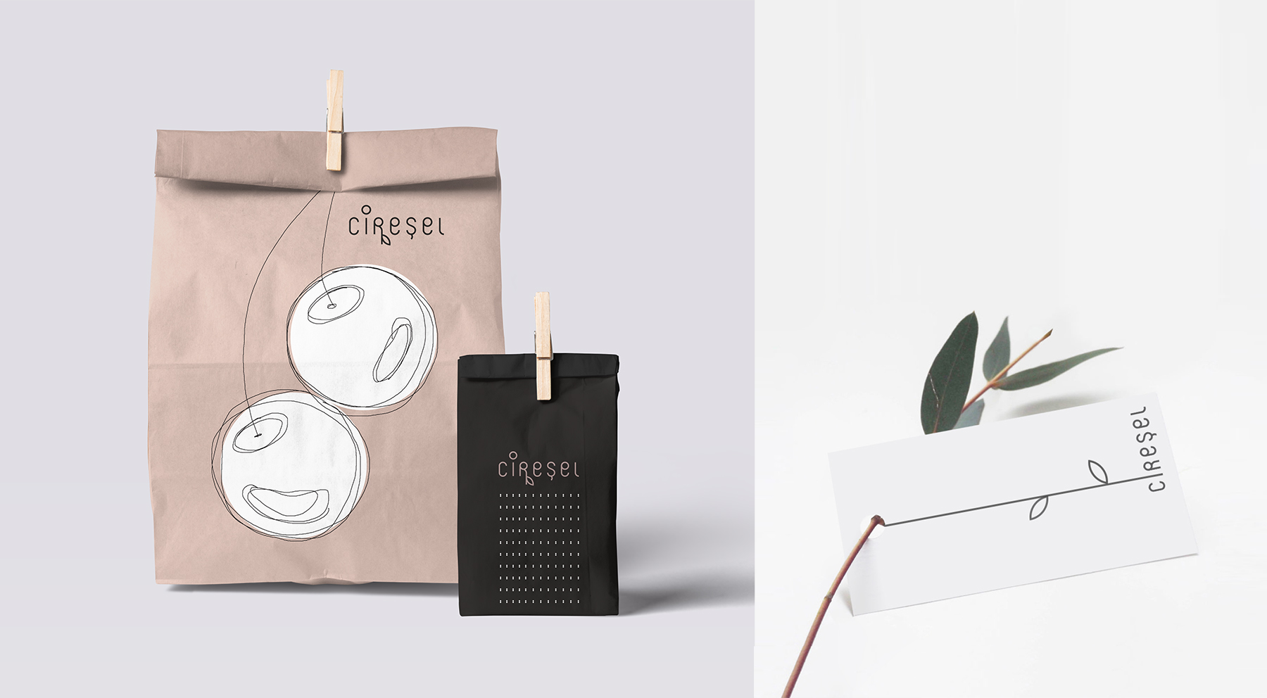
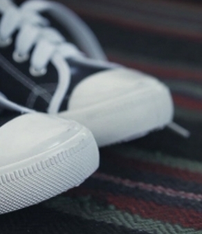
Kids clothing should be tailored for and around their special needs. Ciresel wants to give children the freedom to explore the world, using loose patterns that do not obstruct the movement, natural fabrics and embroidered details to cultivate their love for nature and stories.
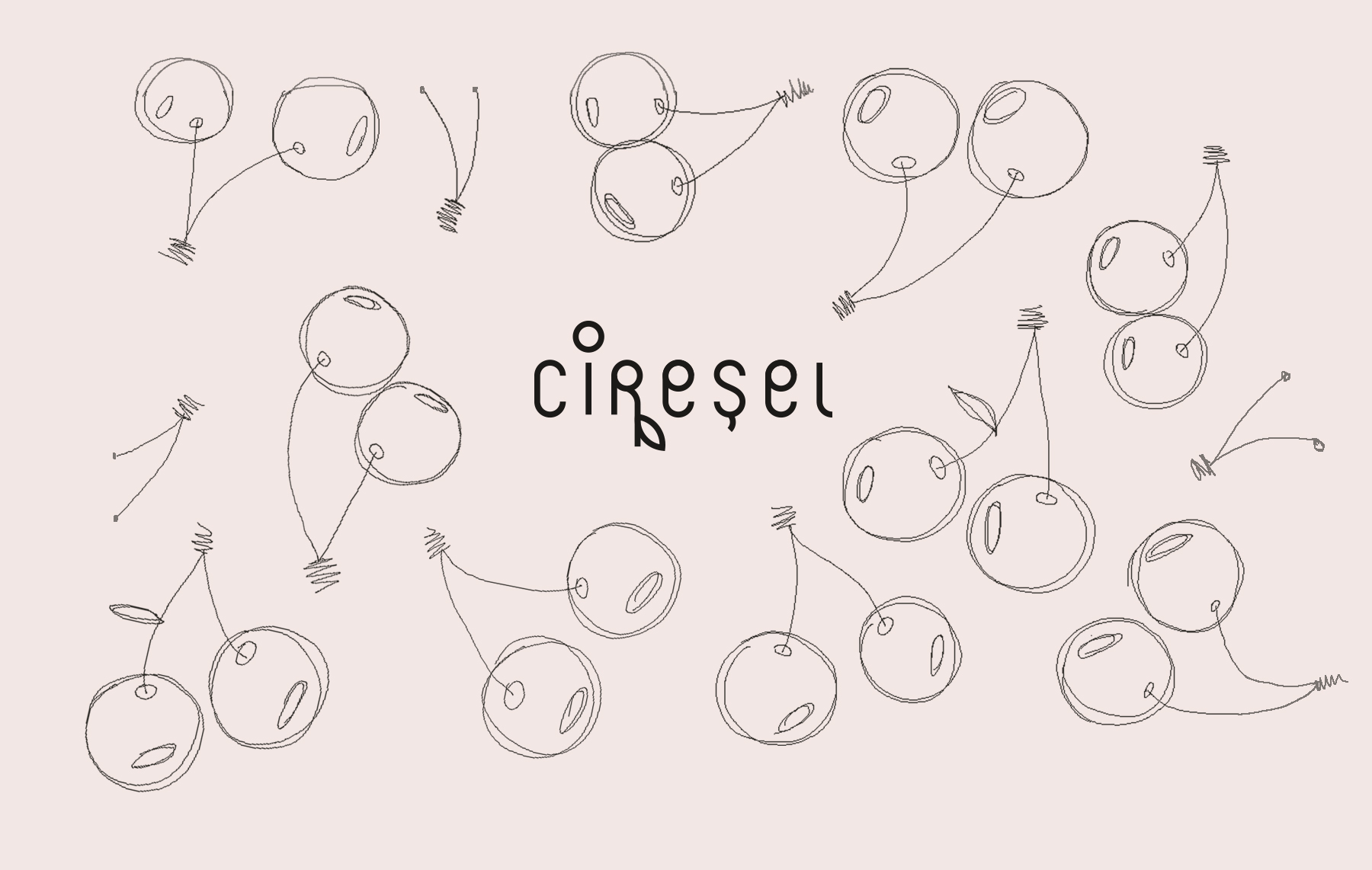
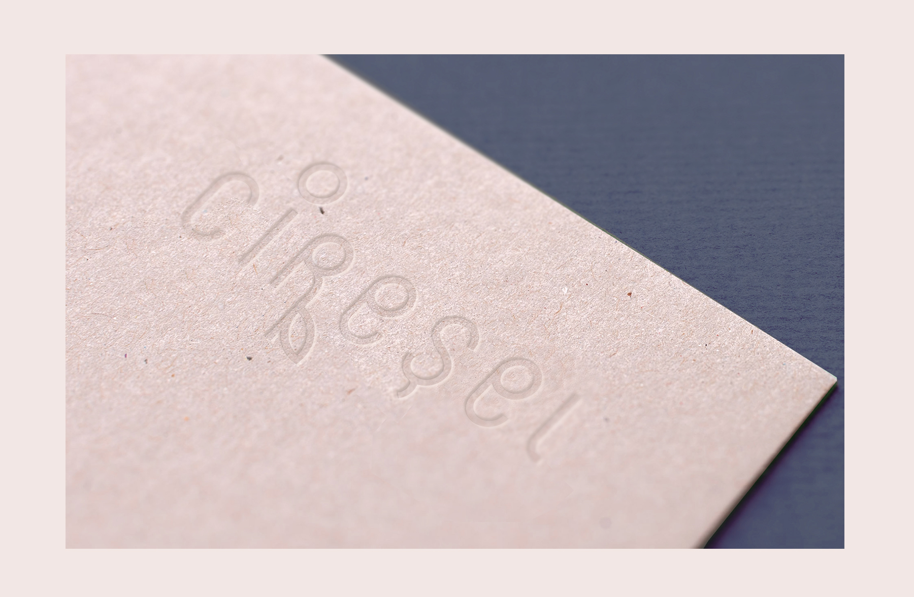
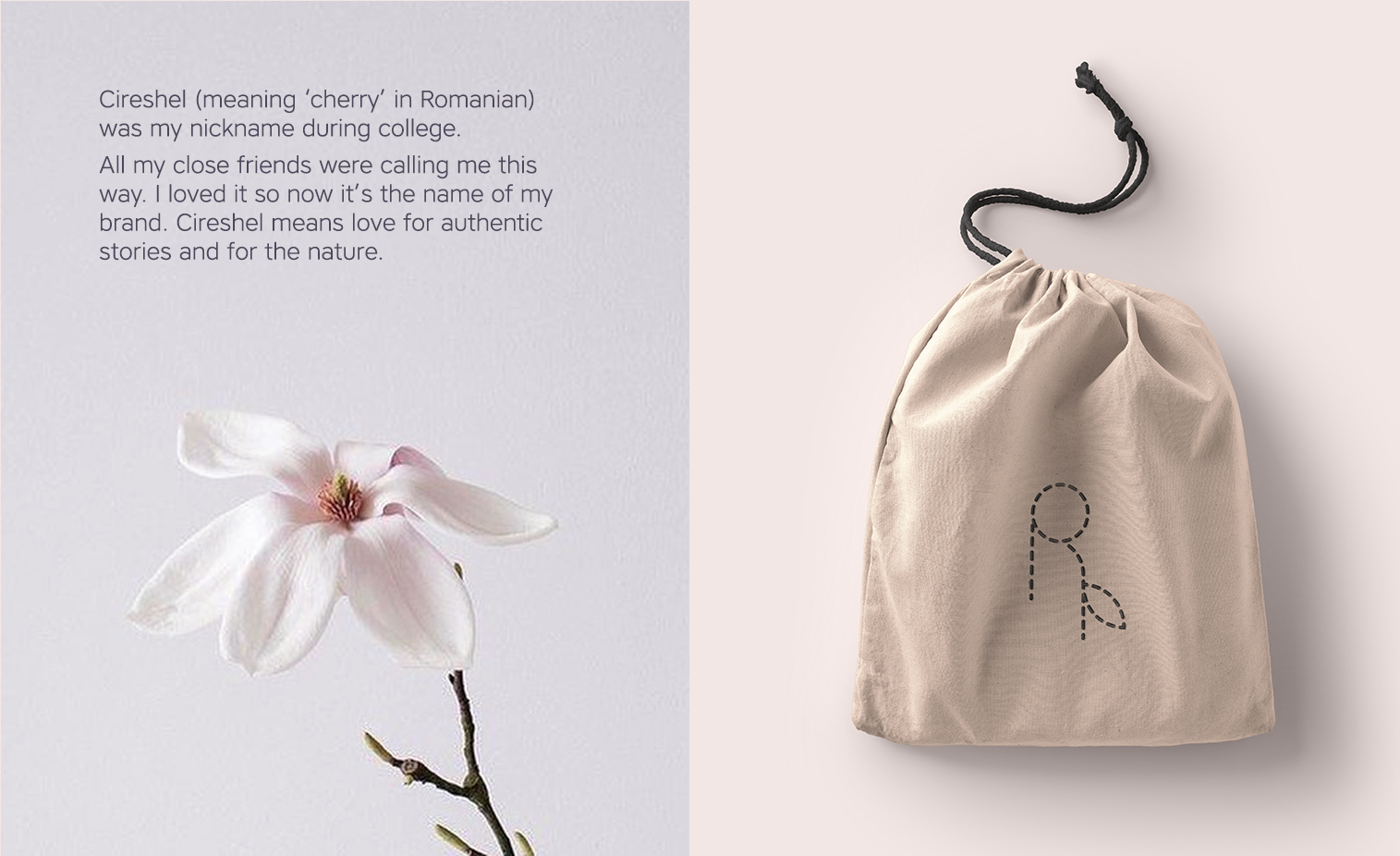
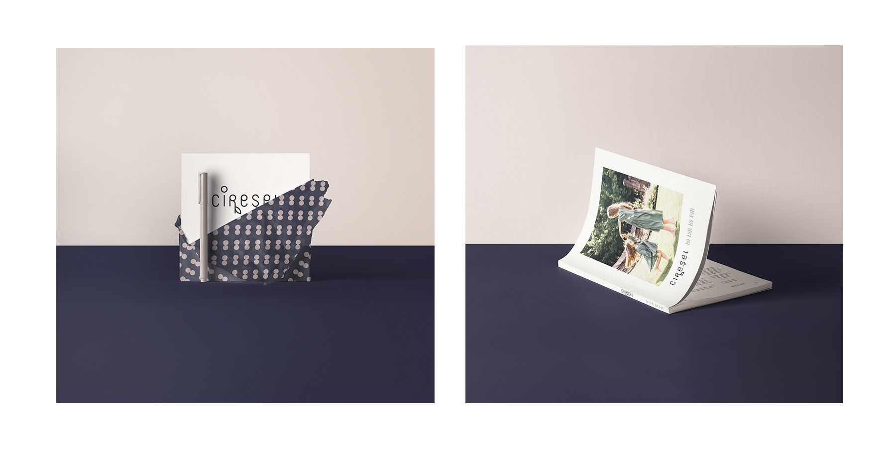
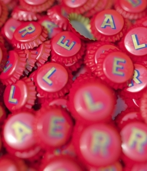
These are the values we kept in mind while designing this identity. Guided by the name (meaning "cherry" in Romanian) we sketched the logo on a grid composed by pairs of cherries. Although the structure is quite rhythmical and rigid, the letters came out ruffled, atypical. We wanted to keep this playful, imperfect spirit of childhood.
Ciresel is small, so it grows, it changes constantly. The same characteristic is valid for the logo, it can be easily modified, giving the possibility to grow it's brunches as it wants.
graphic designer: Anta Petrenco
creative director: Olga Radu
account manager: Iris Crețu
copywriter: Veronica Țurcanu
